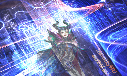
My vote goes for Entry 1 as a support. I want to see another SOTM entry from who made Entry 1 so I will add something to think about, bellow.
Firstly I want to congratulate you (Entry 1) for the fact that you chose to participate. Many people out there have some graphic skills but they're greatly disadvantaged by a very common affliction that affects artists: self demotivation. Now, if your entry was made as a joke, karma will know what to do

This is going to be a big ass post (bear with me), important for both entries but I will focus more on Entry 1, so I will break it into parts:
Aspect ratio of the elements.
One important aspect when dealing with graphic elements is keeping them the same aspect ratio as you receive them.
This is available for Entry 2 as well. I see you both stretched the render horizontally. The idea is that the eye sees stuff that the mind cannot process at first, and this results into you disliking it without knowing why. So when you work with a render, you can resize, crop it as you want but keep it the same
aspect ratio. Meaning if your render has 100x100px keep it 100x100px or make it smaller 64x64px, or 27x27px,
not 64x23px. In my opinion the render did not need to be stretched horizontally for any of the entries. One reason you both might have done this is because you felt the need to fill the space around the render. The best way to fill this space is with other elements, or choose a complex background to place your render in, like [MENTION=39182]SirTony[/MENTION] did
here, or [MENTION=13183]Heruvim[/MENTION] in
here. You can always find ways to fill the empty space around your render, if you have to use a vertical render in a horizontal format.
Here's another example made by Heruvim. Check Show Off section to see more examples.
Another aspect in using a render for a composition is that you can crop it. There's no need to keep it as it is given. You can use it in a large scale or a small scale, you can position it centered or on the left/right of the composition. If you wished to create a warp-in effect, I suggest you do it by using Blending Mode of the layer. Now I feel like you lowered the opacity of the render and that does not quite do it.
Qualitative assets.
For Entry 1 I also suggest you use more qualitative images when you want to create something. This way you ensure more chances that the eye would like your composition. Using lower quality images makes the composition pixelated and it's not okay since the format is pretty small and you can find bigger images/effects/c4ds out there than the format required for this event.
Color palette.
In terms of color, you have to minimise to a lower number of colors used in your composition. I see blue as a predominant color, but I also see red, pink-ish, purple, green. If you are not experienced in picking a color pallete yet, an awesome and easy tip to do so for your composition is to follow the render's colors. Entry 2 has done this and the result is pretty good. Using green and purple, as the render has, it did it's magic. Also, Entry 2 has yellow included, which is a complementary color that goes well with the predominant green. Check more info about
color wheel, maybe this will help.
Text.
As for the text placement, I'd always go with placing it more integrated into the composition. If you place it close to the margins of your composition and if you make it small, you only lead the eye to believe that you did not know what to do with it so you discarded it in that lower corner of the composition

. The eye sees and knows everything!
When you add text into a composition you have 2 options (that I can think of at this moment) either place it as a logo, independent of the composition, like Entry 2 has. You can see similar placing of the texxt in my compositions,
here or
here. Or you can integrate it more into the composition as Heruvim did
here.
Here's another example of integrating it more in the composition. If you still don't understant the difference between having text integrated into your composition vs having it placed as a logo,
here's a very good example. The left one is integrated and the right one is placed.
Since the composition has a style and a color palette, even if you choose to place your text or especially if you integrate it into your composition, it's best to add it a style also. The style could be complementary with the composition or in the same style. Example for same style of the txt as of the composition,
here, and
here as complementary. The first thing to do when mixing up your text is using more than 1 font, especially if you have a long text. You can break it into 2, for sure. Then add diferent colors or same but different texture, or use all caps or non caps. Entry 2 did a good job with this.
Entry 2 opinions and tips.
As for Entry 2, I would have pushed the text more into the center, good job on choosing yellow as a third color, congrats on integrating the c4d with the render, adding that spark on the hand, I see that you cropped the part where the hand is in front, good job with spotting that. For your next entry I'd try to add some effects in front of the render also. Adding them on top of the render+using Blending Mode on the layers can help you integrate your render more into your composition. Good job on making the purple more visible and also adding some shiny color in her eyes. It's always a plus when you're working on the render also and not use it as it was given.
Congrats for both of the forumers who submitted entries this SOTM. I hope I will see you again next month!


