Hello dear Inifinitians
Time to vote and choose the best Signature of the Month
• Event Thread •
.: VOTES WITHOUT A REASON WILL BE DELETED :.
Users who can vote:
Here are the entries:
GOOD LUCK EVERYONE!
Time to vote and choose the best Signature of the Month
• Event Thread •
.: VOTES WITHOUT A REASON WILL BE DELETED :.
Users who can vote:
Owner
Administrator
Head Game Master
Lead Moderator
Head Event Master
Senior Game Master
Senior Moderator
Senior Event Master
Game Master (including trials)
Moderator (including trials)
Event Master (including trials)
Honorary Staff
GFX Team Leader
GFX Team
Wiki Team
Supporter
Forum Supporter
ULTIMATE IMES WINNER
IMES Winner
Legend
Infinity Artist
ULTIMATE FIMES WINNER
FIMES Winner
ULTIMATE INFINITIAN
Forum Hero
Here are the entries:
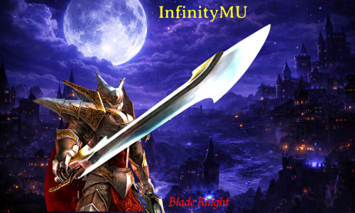
-Albaz

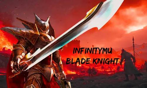
Hosea
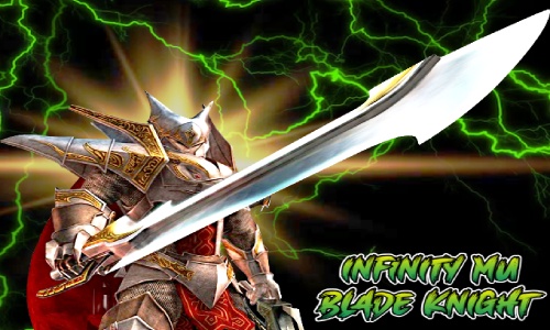
xxSlash
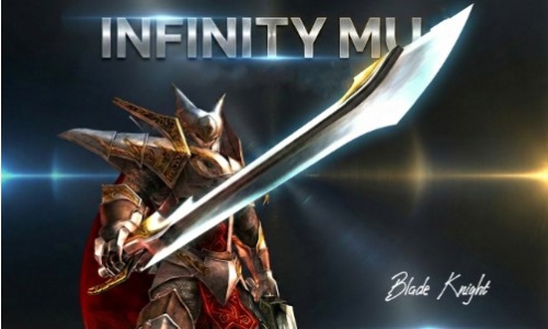
GIBO
GOOD LUCK EVERYONE!